


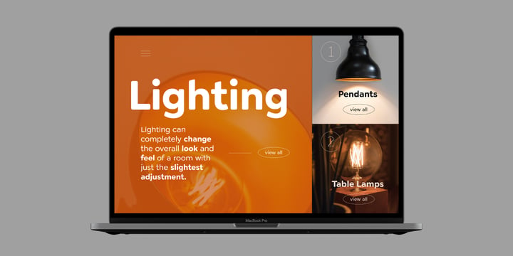
Geometric forms make this elegant industrial font family a great companion for titles, invitations and signs, indoor and outdoor.
Geometric forms make this elegant industrial font family a great companion for titles, invitations and signs, indoor and outdoor.
With its slightly rounded terminals Cerco is a soft and friendly font family with a bit of a warm and playful appearance. The intermediate styles suite perfectly for body texts while the strong weight especially look beautiful at display size.
Cerco is suitable for a wide range of applications in digital and printed environments: advertising and editorial design, signage and way-finding systems as well as brand design can profit from its appealing and modern design.
 |
| Download Cerco Fonts Family From FontPeople |
| |
Billie is a humanist sans with a calligraphic influence designed for editorial purposes. It includes 6 weights in upright and true italics. The font family is loaded with different styles of numerals that can be activated through opentype features to enhances performance in text settings.
This type family is spirited and has a friendly appeal. The type face is also available as two variable fonts.
 |
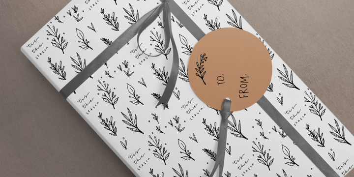
Leaves and Twigs is a quirky handwritten font trio and floral illustrations collection with fun variations, that is perfect for logotype design, branding and packaging, and social media posts.
Just in time for the holidays, Leaves and Twigs is also perfect for homemade seasonal designs (such as postcards, prints, and present tags).
Included in this collection:
All written with the same pen, at the same size, so that the line width is consistent throughout the collection, for easy pairing (floral illustrations are sized down by 4x).
 |
| Download Leaves and Twigs Fonts Family From Ana's Fonts |
 |
A mix of Renaissance & tropical atmosphere
Basco is an exploration of the Renaissance style, a period in which letterforms were informed primarily by hand writing. It is clearly a contemporary interpretation of calligraphic shapes forms.
The serifs are subtly asymmetrical. Slightly curved arches on the n, m and u are noticeable, creating an interesting tension in the text. Bruno Mello’s distinctive style is most obvious in his mastery of super fluid curves. It is a result of his extensive exploration of calligraphic forms, their tensions and dynamics, mixing angularities with curves. The roman weights include alternate swashes, as well as initial and terminal glyphs. The italics, based on chancellery script, feature simple stroke endings, most visible on the s and c.
 |
Blastered was originally inspired by an old horror movie poster - but I find it more laid back and less horrifying…but feel free to use Blastered for your next horror project and use the more than 300 interlocking ligatures! Wow!
 |
Blinked is a stylish handwritten script font. It is suitable for your crafting projects, but also for logos, quotes and so much more.
©
Ruslana Kolesnikova
2014 . Powered by
Blogger
Blogger Templates
.
.