


The poster for the 1930 film “Show Girl in Hollywood” had the title hand lettered in a squared Art Deco style with some angled cross strokes. This became the basis for Dancing Girl JNL, which is available in both regular and oblique versions.
The poster for the 1930 film “Show Girl in Hollywood” had the title hand lettered in a squared Art Deco style with some angled cross strokes. This became the basis for Dancing Girl JNL, which is available in both regular and oblique versions.


A 1930s travel poster from American Airlines had the airline’s name in a classic thick-and-thin Art Deco design of hand lettering. With the addition of angular spurs, some of the characters become semi-serif in nature.
This type style is now available as Travel Plans JNL, in both regular and oblique versions.


Around 1931, the Los Angeles Times (in partnership with the Richfield Oil Company) installed on its building a moving message board similar to the one at the New York Times in New York City which they dubbed an “electric newspaper”.
The style of characters used on this electronic sign were the basis for the namesake font Electric Newspaper JNL, which is available in both regular and oblique versions.
A blank space to place between words is available on both the solid bar and broken bar keystrokes.


The words “Benny Goodman & His Orchestra” on an appearance poster for the band from 1936 were rendered in a beautiful semi-script style of hand lettering.


The thin and stylish Art Deco lettering of a neon sign above the Greyhound bus terminal entrance in a 1930s New York City photo inspired Transit Station JNL, which is available in both regular and oblique versions.


A 1930s WPA (Works Progress Administration) poster advertising an exhibit of New Jersey area posters had its main lettering rendered in a very condensed hand lettered interpretation of the ever-popular Futura Black Art Deco style.
This has now been re-drawn and digitized as Art Event JNL, in both regular and oblique versions.


A 1930s advertising poster for the Inman Brothers Flying Circus offered up an interesting hand lettered Art Deco design that’s a cross between both squared and rounded character shapes.
Because of it's 'futuristic look', the resulting type style can also lend itself to 1970s and 1980s retro projects as well as those from the 1930s and 1940s.
Now a digital font, Air Circus JNL is available in both regular and oblique versions.
A “Flying Circus” is a troupe of ‘barnstormers’ (stunt pilots) who performed aerial tricks either individually or as a team along with selling airplane rides to the general public.


Here’s yet another interpretation of the classic “thick and thin” sans serif lettering most popular during the Art Deco era.
This particular design comes to you through the courtesy of a hand lettered 1930s travel poster from the Pennsylvania Railroad. Some capitals are much wider than others, while the lower case ‘i’ is somewhat truncated.
Rail Travel JNL is available in both regular and oblique versions.


The hand lettered opening title for the 1935 movie “Thanks a Million” is rendered in a condensed, thick and thin Art Deco sans serif design.
It is now available as the digital typeface Stocks and Bonds JNL – in both regular and oblique versions.
The hand lettered opening title for the 1935 movie “Thanks a Million” is rendered in a condensed, thick and thin Art Deco sans serif design.
It is now available as the digital typeface Stocks and Bonds JNL – in both regular and oblique versions.
 |
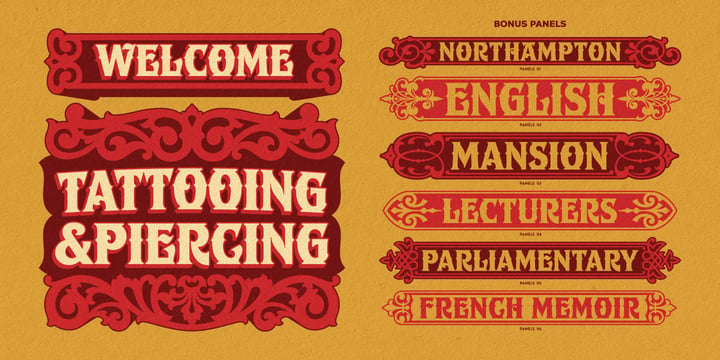
Ephemera Shoemakers is a bold font with spurred serif & medium contrasted, vintage inspiration with letters in all caps. Traditionally this type of decorative font that emerged in Italy, France & England in the nineteenth century were used in large headlines and posters that were closely related to circus shows, carnival or environments of the Far West American. Perfect for signs, posters, handbills and other large format advertising.
Ephemera Shoemakers Pdf Specimens
 |
| Download Ephemera Shoemakers Fonts Family From Ephemera Fonts |


 |
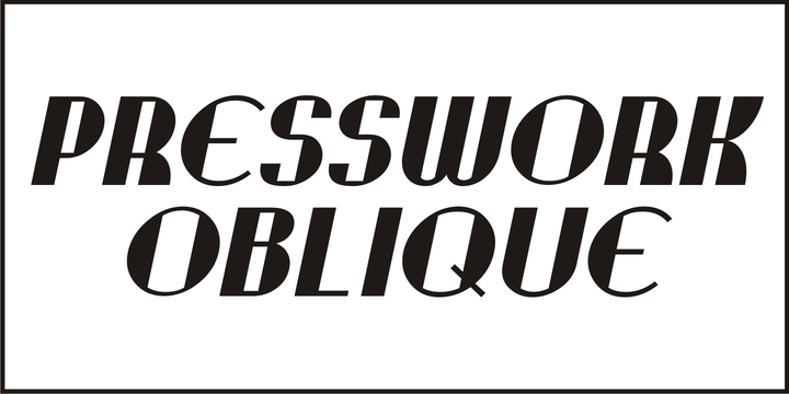 |
| Download Presswork JNL Fonts Family From Jeff Levine |


