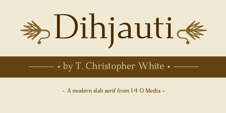
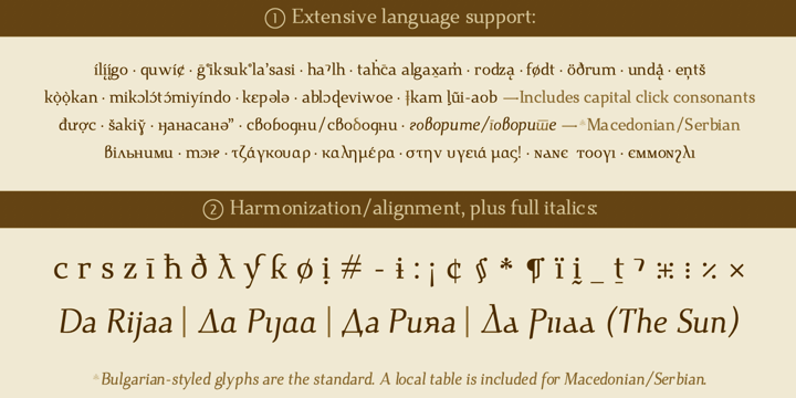
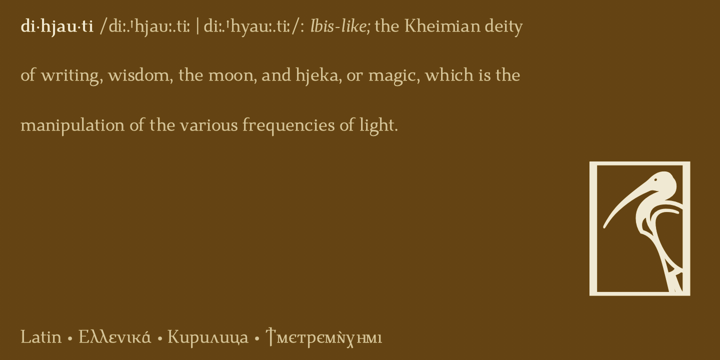
Dihjauti /di:.'hjau.ti: | dee.'hyow.tee/, predominantly based off Dwiggin's Electra with shades of Palatino and Perpetua, is modern and stately. Like its inspirers, it has broad counters and spacing, which temper it and give it warmth, making it comfortable and well-suited for longer texts. It is balanced in all aspects, from its punctuation to its reference marks and symbols. Its design takes into consideration all extra characters for languages that few fonts support, such as African and First Nation. These extra characters, such as Edh, Esh, Gamma, Ezh, Yogh, the pharyngeal fricatives, the click consonants, which have added capital versions, the glottal stops, et cetera, actually look like they belong, as opposed to being afterthoughts. The italic incorporates a touch of Arrighi. It includes all transcription systems relevant to the Latin, Cyrillic, and Greek alphabets, as well as standard Coptic, plus extra characters for Teuthonista and First Nation. It also includes, to list a few, Egyptian-styled pictographs (where applicable), APL, a plethora of mathematical symbols and arrows, and a number of alternatives in the PUA. A Fontlog is included for referencing all additional characters.
Notes: 1) The superscript characters, modifier letters, and the numerators, are all part of the superscript table. 2) The bold versions of the font have some alternative/reversed characters; I did this because there is no difference in the math or punctuation symbols, i.e., the bold versions are not actually bold (with exceptions), which gives the font a better harmony. 3) The font uses anchors, which means that it will not align properly for linguistic use, or otherwise, without open type. 4) For those interested, Open or Libre Office can access all glyphs using: Insert > Special Character.


