![Knight Knight](https://cdn.myfonts.net/cdn-cgi/image/width=720,height=360,fit=contain,format=auto/images/pim/10000/YWtCcwKaUQdU6wOvfV5zsJ7z_a9e4a1213cb168ba146dfbfafacd60b6.png)
Knight Font Family was designed by Bakhrudin Ja'far, and published by Jafar07. Knight contains 2 styles and family package options.
![]() |
Seasonal Drift is a brush font that I made using one of my father in law's Chinese brushes and ink. For some reason this font reminded me of the ocean, like waves and currents and driftwood.
Seasonal Drift comes with a healthy dose of language support and some cool discretionary ligatures.
![]() |
Seasonal Drift |
![]() |
Introducing a new font from our Script Collection called Willydope. This hand-drawn typeface is made in a digital hand-drawn style with a classy scripted look. This font is good for logo design, Social media, Movie Titles, Books Titles, short text even long text letters, and good for your secondary text font with sans or serif.
**Featured:**
* Standard Uppercase & Lowercase
* Numeral & Punctuation
* Multilingual : ä ö ü Ä Ö Ü ß ¿ ¡
* Alternate & Ligature
* PUA encoded
We recommend programs that support the OpenType feature and the Glyphs panel such as Adobe applications or Corel Draw. so you can use all the variations of the glyphs.
Hope you enjoy our fonts!
![]() |
Montoro Display is a Brand New Luxury Typeface with a powerful font family. It has a dependable and uncompromising style, with controlled letterforms and modern touches. It looks amazing in logos, magazines, and movies . Montoro Font would be perfect for branding, headlines, Captions, paragraph, and posters . The various weights allow you to experiment with a wide range of applications. It's created to make an impression without sacrificing its beauty and readability. It's shown a clean, minimalist, warmth, quirky, yet still purposed to be versatile
The Typeface includes Six Weights - Regular, Medium, SemiBold, Bold, ExtraBold, and Black. All offer wide language support, upper and lower cases, numerals and extended punctuation.
Thank you for taking the time to look into the font.
![]() |
Montoro Display |
Mogathe was inspired by the west life era. Mogathe is a slab serif font with a vintage western look and feel. Four varieties are available: Regular, Stamp, Spurs, and Spurs Stamp. The use of this font results in carefully-crafted styles.
Mogathe font is ideal for branding projects or packaging that need a vintage western feel.
Alderney is a friendly font family in three weights, Light, Regular and Bold, designed by Stephen E Rowe for the foundry Fontelan. It is a gentle script crafted for more relaxed display needs, but, being oblique in character, it gives an air of excitement to many projects, especially in all caps situations. Unlike many scripts, the capitals can be successfully used as a great display option.
All glyphs have a smooth curve and a broad, flowing, low aspect. The light version lends itself to airy design possibilities, again, especially when the caps are used for display purposes. The regular version is a well balanced script that remains spacey and elegant, and the bold version is excellent for a display that suggests excitement.
Chalisha is a chic modern script font that flows smoothly and elegantly on any design you make, a must-have to add to your chic modern script collection. Best choice for logo, album covers, quotes, greeting cards, book covers, wedding design, social media posts, and much more.
Chalisha has a full set of uppercase and lowercase letters, numerals, punctuation, and OpenType features such as ligatures and beautiful swashes.
Rainesta comes with 7 unique font styles, you can use them according to your project, whether for headlines or taglines. This font is very suitable to be applied to various other formal forms such as websites, ebooks, labels, logos, magazines, books, packaging, fashion, make-up, stationery, labels, or all kinds of advertising purposes.
Features:
7 styles
uppercase & lowercase
numbers and punctuation
multilingual
ligatures
PUA encoded
Thank you.
The Morille is display bold serif typeface. The shape is classic and unique style. You can also get more elegant serif in alternate and ligature. With vintage fill It's great for logotypes, wedding invitations, romantic cards, labels, packaging, spelling of names and others. Add to your most creative ideas and watch how they bring them to life!
Designed primarily for editorial use, Silva is a superfamily ideal to typographically complex environments requiring a highly versatile typeface. With slightly condensed proportions, generous x-height, moderated ascenders and descenders and robust serifs, it is an extremely readable and economic type. Subdivided in two optical sizes, the family has a total of 26 fonts including italics. Silva has an extensive character set — with extensive language support — that provides both old style and lining figures as well as their respective tabular versions, fractions, various ligatures, small capitals, arrows and a number of different symbols.
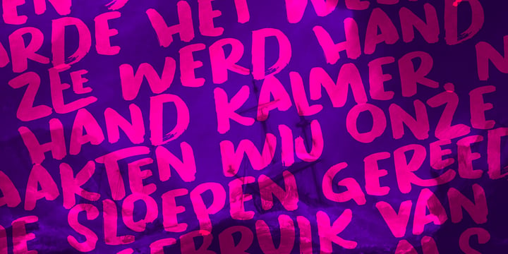
“La Belle Zabriella” - new elegant luxury font family from Julia Visht.
Classical font collection: luxury modern Serif (Bold, Regular, Light) with stylish decorative elements and classy authentic Script!
La Belle Zabriella is a must-have for your collection of fonts.
Main features:
-Ligatures. Set of opentype ligatures allows to make your design truly unique.
-Alternates. Set of lowercase alternates allows you to create even more authentic custom-feel text.
- OpenType Style Set. Open Type Style Sets allow to create many perfect styles of your text.
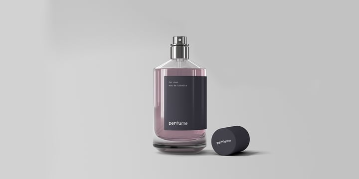
-Multyfunctionality. It's perfect for: elegant modern branding, web-design, logo creating, posters, headers, advertising, wedding stationery, book cover designs, classy packaging, album covers, handwritten quotes, greeting cards, wall art, websites, photos, and so much more.
-Multylangual support. English, German, Italian, French, Danish, Norwegian, Swedish, Italian, Spanish, Filipino, Scottish Gaelic, Indonesian, Irish, Swiss German, Portuguese.
Stylish font family for stylish projects!
Happy creating!
Designers: Julia Kruk
Publisher: Julia Visht
Introducing, Ampelas Brush Script. This hand-made font is well crafted with original dry brush imperfections that make this font perfect for delivering an extremely fearless message in your design without losing the natural impression.
Ampelas Brush Script is very suitable for various types of design needs such as branding materials, t-shirt, food packaging, business cards, logos, posters, and more.
This font comes with a complete set of lowercase alternates, numerals, a large range of punctuation ligatures, and Special European Characters. The OpenType features can be accessed by using OpenType savvy programs such as Adobe Illustrator, Adobe InDesign, and Adobe Photoshop
Bastro is a bold retro serif fonts that feels casual and clean an incredible modern retro aesthetic. Use this Bastro serif font to add that special modern retro touch to any design idea you can think of!
Masterfully designed to become a true favorite, this font has the potential to bring each of your creative ideas to the highest level!
This font is PUA encoded which means you can access all of the glyphs and swashes with ease!
Enjoy!
Hello Everyone, introduce our new product Lemonade Soda - Bold Handmade Carefully Crafted All Caps Display, inspired by the title of the sports poster and We make it very energetically. Lemonade Soda font with strong and challenging nuances. very suitable for the title, typography, Poster, magazines, brochures, packaging,Websites and much more for your design needs, making your designs more modern and professional
Inspired by Logo style and combination with Cute Craft style. that will fulfill your design needs for quotes,sporty theme, logotype, wordmark, etc. This has many opentype features and support multi language.
Minigap is a geometric sans serif family that has a minimal height difference between upper and lower case. In other words if you’re into typography, it has a very high x-height... yes, very high.
The choice was made to finally have a typeface that could appear very neat, reducing ascending and descending parts of the glyphs (b, d, g, j, l, ...) that could interfere with the lines above and below. All of that without going to extremes in a unicase style but also without renouncing to a great legibility.
This aesthetic, in fact, translates into a pleasant visual effect that creates well-defined lines and enhances the layout, looking excellent on small screens.
A meticulous optical correction, starting from pure geometric lines, was applied to every glyph, aiming to obtain the best version of each.
The pointed corners of capital letters and numbers have been kept even in the heavier styles, to give consistency to the family. You can clearly see how clean they look.
Stylistic alternates are included:
Minigap is a universal font, versatile by nature, it can work in countless situations. From physical products such as company material, signage and magazines, to digital environments like apps and websites. Very suitable for embracing a corporate rebrand.
It is available in 14 styles (7 uprights + matching italics), has OpenType features and supports multiple languages.
The Regular weight is offered for free, have fun!
Check out other unique fonts by Gravitype here.
©
Ruslana Kolesnikova
2014 . Powered by
Blogger
Blogger Templates
.
.