


The hand lettered opening title for the 1935 movie “Thanks a Million” is rendered in a condensed, thick and thin Art Deco sans serif design.
It is now available as the digital typeface Stocks and Bonds JNL – in both regular and oblique versions.
The hand lettered opening title for the 1935 movie “Thanks a Million” is rendered in a condensed, thick and thin Art Deco sans serif design.
It is now available as the digital typeface Stocks and Bonds JNL – in both regular and oblique versions.


The namesake for this type design was the dust jacket for the 1926 book “Revelry”.
A classic Art Deco thick-and-thin design, Revelry Deco JNL is available in both regular and oblique versions.


A 1942 menu cover for the restaurant at the Biltmore Hotel in Los Angeles features its name in a stylized Art Deco serif design.
This is has been turned into the digital typeface Bill of Fare JNL, and is available in both regular and oblique versions.


As the basis for this new font artist and designer Lena Schmidt used an old font design by her mother Jutta. At a young age, her mother drew and illustrated a lot with pen and ink. She made beautiful illustrations and many font designs. Schmidt chose one of these drafts - delicately drawn Donovan lyrics - as the basis for this digital handwritten stencil font. What emerged from it is a stencil text and display typeface that relates to Auriol's art nouveau typefaces and the era of impressionism.
More weights will be published in soon.
Published by Spirit & Bones
www.spiritandbonesdesign.com
Designed by Lena Schmidt
www.lenaschmidt.com


SK Mutka is a geometric sans serif made in the style of Art Deco. Its graceful forms are emphasized by the arched structure typical for the style and spirit of Art Deco. The typeface is suitable both for decorative work and for typing because it includes uppercase and lowercase. Moreover, it supports a wide language range. SK Mutka typeface supports extended Cyrillic, Latin, as well as an extensive character set. SK Mutka is perfect for bold and classic designs, for print and web works.


Say Hello to Gegor, an experimental serif display font.
Gegor is freedom of our hand when creating the letterform without many references. We try to let the pen tool flow and dancing according to our imagination. The characters of this typeface are adopted from the letter "r". She was born and influence each other. The simple shape on the shoulder are slightly pointy at a thick weight and curves at a thin weight have a big influence on other letters. The unique form of letter "r" takes us to further development to get achieve a distinct harmony as a display typefaces.
If you look at the teaser images and get an idea, we are in line.
Gegor consists of 14 families from thin to black, and 1 outline style in black weight equipped with discretionary ligatures, case-sensitive forms, ordinals, small capital, and fractions. Consists of multilingual support including Western European, Central European, and Southeastern European.
Gegor is perfect for posters, logos, branding, magazines, websites, and more. Gegor will give a unique vibe to your works.
Supports languages:
Afrikaans, Albanian, Asu, Basque, Bemba, Bena, Bosnian, Catalan, Cebuano, Chiga, Colognian, Cornish, Corsican, Croatian, Czech, Danish, Dutch, English, Estonian, Faroese, Filipino, Finnish, French, Friulian, Galician, Ganda, German, Gusii, Hungarian, Icelandic, Ido, Inari Sami, Indonesian, Interlingua, Irish, Italian, Javanese, Jju, Jola-Fonyi, Kabuverdianu, Kalaallisut, Kalenjin, Kinyarwanda, Kurdish, Latvian, Lithuanian, Lojban, Low German, Lower Sorbian, Luo, Luxembourgish, Luyia, Machame, Makhuwa-Meetto, Makonde, Malagasy, Malay, Maltese, Manx, Maori, Morisyen, North Ndebele, Northern Sami, Northern Sotho, Norwegian Bokmål, Norwegian Nynorsk, Nyanja, Nyankole, Occitan, Oromo, Polish, Portuguese, Romanian, Romansh, Rombo, Rundi, Rwa, Samburu, Sango, Sangu, Sardinian, Scottish Gaelic, Sena, Shambala, Shona, Slovak, Slovenian, Soga, Somali, South Ndebele, Southern Sotho, Spanish, Swahili, Swati, Swedish, Swiss German, Taita, Taroko, Teso, Tsonga, Tswana, Turkish, Turkmen, Upper Sorbian, Vunjo, Walloon, Welsh, Western Frisian, Wolof, Xhosa, Zulu


Lady Edith harkens back to the days of flappers and cocktail parties. The early part of the twentieth century, when Art Deco was at it’s height and high fashion was all the rage. A time of beauty, class and elegance. A minimalistic font with clean lines and just enough flare to make it unique. The perfect font for any occasion that needs a bit of high end magic.
There is no lower case for Lady Edith as it is a decorative font. The Upper case version serves both the upper and lower case keys.
Lady Edith has a glyph count of 397 and supports the following languages;
Supported Languages: Afrikaans, Albanian, Asu, Basque, Bemba, Bena, Bosnian, Catalan, Chiga, Colognian, Cornish, Croatian, Czech, Danish, Embu, English, Esperanto, Estonian, Faroese, Filipino, Finnish, French, Friulian, Galician, German, Gusii, Hungarian, Icelandic, Indonesian, Irish, Italian, Kabuverdianu, Kalaallisut, Kalenjin, Kamba, Kikuyu, Kinyarwanda, Latvian, Lithuanian, Low German, Lower Sorbian, Luo, Luxembourgish, Luyia, Machame, Makhuwa-Meetto, Makonde, Malagasy, Malay, Maltese, Manx, Meru, Morisyen, North Ndebele, Norwegian Bokmål, Norwegian Nynorsk, Nyankole, Oromo, Polish, Portuguese, Romanian, Romansh, Rombo, Rundi, Rwa, Samburu, Sango, Sangu, Scottish Gaelic, Sena, Shambala, Shona, Slovak, Slovenian, Soga, Somali, Spanish, Swahili, Swedish, Swiss German, Taita, Teso, Turkmen, Upper Sorbian, Vunjo, Walser, Zulu


Dan Hardie, a Miami-based graphic artist and creative consultant at Mutiny, Inc. shared an image he’d spotted online of some interesting signage formerly on the front of the Miami Medical Building.
Comprised of hand-cut metal characters (with a thoroughly avant-garde “Art Deco meets Modernist” approach), this instantly became a font design idea unusual and quirky enough to develop as a digital typeface.
The end result is Office Visit JNL, which is available in both regular and oblique versions.
 |
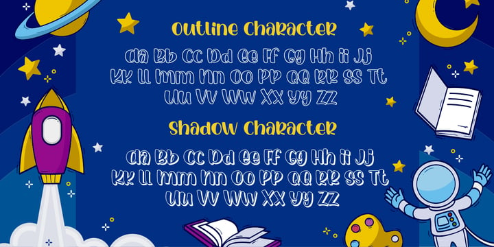
Luar Galaxy a Handwritten Display Font With 3 Style (Regular,Outline and Shadow)
You Can Mix And Match for Your Awesome Project
This fonts is ideal for crafting, branding and decorate your any project. This fonts are perfect for wedding invitation or your blog. Also with their help, you can create a logo or beautiful frame for your home. Or just use for your business, book covers, stationery, marketing, magazines and more.
FEATURES :
Uppercase & Lowercase
Number & Punctuation
More than 219 of glyphs
Multilingual Language
PUA Encode
Ligatures
Alternate
The alternative characters were divided into several Open Type features can be accessed by using Open Type savvy programs such as Adobe Illustrator, Adobe InDesign, Adobe Photoshop Corel Draw X version, And Microsoft Word. And this Font has given PUA unicode (specially coded fonts). so that all the alternate characters can easily be accessed in full by a craftsman or designer.
If you don't have a program that supports OpenType features such as Adobe Illustrator and CorelDraw X Versions, you can access all the alternate glyphs using Font Book (Mac) or Character Map (Windows).
To Access Alternate Characters Click The Link Below:
Adobe illustrator CS https://www.youtube.com/watch?v=geL0Ye02Ryk
Adobe illustrator CC https://www.youtube.com/watch?v=V25yiUh8BcE
Ms Word https://www.youtube.com/watch?v=HxkhZiCuwEw
Coreldraw X7 https://www.youtube.com/watch?v=UBVsufJjons
Adobe Photoshop CC https://www.youtube.com/watch?v=BYKXl58AdNY
Indesign CS https://www.youtube.com/watch?v=HgZTCxKG14Q
 |
| Download Luar Galaxy Fonts Family From Gilar Studio |
 |
Avalaqus is a font inspired by certificate, labels, posters, F&B packaging and has ligatures with alternate style that can make your display better than before. You will get a decorative font, sans, serif with bold and outline styles. And you will also get a set of badges with the open type feature format that match this typeface
 |
| Download Avalaqus Fonts Family From Amera Type |


FLOGOTOP works great in branding, logos, headlines, posters. The different weights and combinations give you full range to explore a whole host of applications, from tech startup, local events to concerts, festivals.
 |
Inspired by architect Rudolf M. Schindler's hand lettering, this fearless display font is perfect in vintage and contemporary settings. As timeless as Schindler's designs, Highway Bungalow is sure to impress.
 |
Arlian is how I see an elegant scripting font in 2020. The idea behind this typeface is to create a well-balanced, versatile and gender-neutral typeface.
The typeface does not look overloaded with various elements of the Victorian era. Everything is simplified for 2020, which will also appeal to the younger generation.
 |
Introducing Monday Boulevard - Art Deco Typeface - 4 weights
Monday Boulevard is retro, Art Deco typeface with 4 weights, ligature glyphs, alternates and multilingual support. It's a very versatile font that works great in large and small sizes.
Monday Boulevard is perfect for branding projects, home-ware designs, product packaging, magazine headers - or simply as a stylish text overlay to any background image.
How to access alternate glyphs?
To access alternate glyphs in Adobe InDesign or Illustrator, choose Window Type & Tables Glyphs
In Photoshop, choose Window Glyphs. In the panel that opens, click the Show menu and choose Alternates for Selection. Double-click an alternate's thumbnail to swap them out.
Feel free to contact me if you have any questions!
Mock ups and backgrounds used are not included.
Thank you! Enjoy!
 |
| Download Monday Boulevard Fonts Family From VP Creative Shop |
 |
This is condensed and more visually compact version of Skarpa font. All kerning has been thoroughly revised and manually adjusted.
The font is based on geometric forms devoid of excessive flourishing.
Would suit modern designs either in fashion, technology or laboratory setting. Would look good on door plaques in pharmacy or simple drawer plaques - especially Medium or Bold specimen. Lighter specimens would look good in leaflet & magazine print (see presented posters).
 |
Gron this is an amazing decorative display serif font.
Charming, elegant and attractive, Gron can also be even more expressive thanks to the alternatives that are included in this font. You can play with them and get a beautiful and harmonious result. Gron is perfect for logos, templates, invitations, greetings, book and magazine covers, business cards, branding for your business and much more. Also included in this font are several illustrations that can set the idea for your project.
Gron is easy to use and has OpenType features.
 |
Charlie is a contemporary and stylish display sans serif typeface. Charlie is made with inspiration from art deco style. Charlie works best for use in such as book titles, stationery designs, quotes, branding, logos, packaging designs, posters, and more. it's look classy and authentic!
 |
 |
 |
| Download Presswork JNL Fonts Family From Jeff Levine |